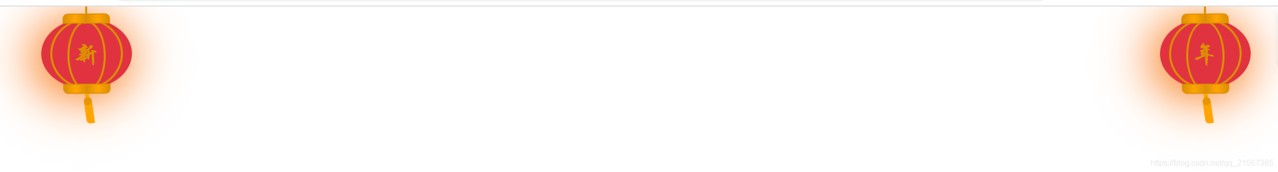
首页显示两边灯笼样式搬砖的小易2个月前发布关注私信0377 代码放在,子比主题设置<自定义代码<自定义底部HTML代码 <!-- 灯笼样式开始 --> <style> .onlymobile{display: none;} @media (min-width: 950px){.nonlymobile{display:inline;} } @media only screen and (max-width: 760px) { .deng-box, .deng-box1 { display:none; } } @media only screen and (min-width: 768px) and (max-width: 1024px) { .right { float: left!important; } } .deng-box { position: fixed; top: -30px; left: 10px; z-index: 999; } .deng-box1 { position: fixed; top: -30px; right: 10px; z-index: 999; } .deng-box1 .deng { position: relative; width: 120px; height: 90px; margin: 50px; background: #d8000f; background: rgba(216, 0, 15, 0.8); border-radius: 50% 50%; -webkit-transform-origin: 50% -100px; -webkit-animation: swing 5s infinite ease-in-out; box-shadow: -5px 5px 30px 4px rgba(252, 144, 61, 1); } .deng { position: relative; width: 120px; height: 90px; margin: 50px; background: #d8000f; background: rgba(216, 0, 15, 0.8); border-radius: 50% 50%; -webkit-transform-origin: 50% -100px; -webkit-animation: swing 3s infinite ease-in-out; box-shadow: -5px 5px 50px 4px rgba(250, 108, 0, 1); } .deng-a { width: 100px; height: 90px; background: #d8000f; background: rgba(216, 0, 15, 0.1); margin: 12px 8px 8px 10px; border-radius: 50% 50%; border: 2px solid #dc8f03; } .deng-b { width: 45px; height: 90px; background: #d8000f; background: rgba(216, 0, 15, 0.1); margin: -4px 8px 8px 26px; border-radius: 50% 50%; border: 2px solid #dc8f03; } .xian { position: absolute; top: -20px; left: 60px; width: 2px; height: 20px; background: #dc8f03; } .shui-a { position: relative; width: 5px; height: 20px; margin: -5px 0 0 59px; -webkit-animation: swing 4s infinite ease-in-out; -webkit-transform-origin: 50% -45px; background: #ffa500; border-radius: 0 0 5px 5px; } .shui-b { position: absolute; top: 14px; left: -2px; width: 10px; height: 10px; background: #dc8f03; border-radius: 50%; } .shui-c { position: absolute; top: 18px; left: -2px; width: 10px; height: 35px; background: #ffa500; border-radius: 0 0 0 5px; } .deng:before { position: absolute; top: -7px; left: 29px; height: 12px; width: 60px; content: " "; display: block; z-index: 999; border-radius: 5px 5px 0 0; border: solid 1px #dc8f03; background: #ffa500; background: linear-gradient(to right, #dc8f03, #ffa500, #dc8f03, #ffa500, #dc8f03); } .deng:after { position: absolute; bottom: -7px; left: 10px; height: 12px; width: 60px; content: " "; display: block; margin-left: 20px; border-radius: 0 0 5px 5px; border: solid 1px #dc8f03; background: #ffa500; background: linear-gradient(to right, #dc8f03, #ffa500, #dc8f03, #ffa500, #dc8f03); } .deng-t { font-family: 华文行楷; font-size: 26px; color: #dc8f03; font-weight: bold; line-height: 44px; text-align: center; } .night .deng-t, .night .deng-box, .night .deng-box1 { background: transparent !important; } @-moz-keyframes swing { 0% { -moz-transform: rotate(-10deg) } 50% { -moz-transform: rotate(10deg) } 100% { -moz-transform: rotate(-10deg) } } @-webkit-keyframes swing { 0% { -webkit-transform: rotate(-10deg) } 50% { -webkit-transform: rotate(10deg) } 100% { -webkit-transform: rotate(-10deg) } } </style> <div class="deng-box"> <div class="deng"> <div class="xian"></div> <div class="deng-a"> <div class="deng-b"><div class="deng-t">龙年</div></div> </div> <div class="shui shui-a"><div class="shui-c"></div><div class="shui-b"></div></div> </div> </div> <div class="deng-box1"> <div class="deng"> <div class="xian"></div> <div class="deng-a"> <div class="deng-b"><div class="deng-t">快乐</div></div> </div> <div class="shui shui-a"><div class="shui-c"></div><div class="shui-b"></div></div> </div> </div> <!-- 灯笼样式结束 --> 展示效果: 供学习和研究使用,禁止商业用途 购买前可以联系作者确认资源信息,防止交易矛盾 © 版权声明 版权声明 1 本网站名称:易幻云资源网 2 本站永久网址:https://www.yihuanyun.cc 3 本网站的文章部分内容可能来源于网络,仅供大家学习与参考,如有侵权,请联系站长 QQ2956667505进行删除处理。 4 本站一切资源不代表本站立场,并不代表本站赞同其观点和对其真实性负责。 5 本站一律禁止以任何方式发布或转载任何违法的相关信息,访客发现请向站长举报 6 本站资源大多存储在云盘,如发现链接失效,请联系我们我们会第一时间更新。 THE END美化教程 喜欢就支持一下吧点赞7收藏